Guide
The Principles of Effective Web Design
David Leon Engelmann · September 25, 2026 · 9 min read
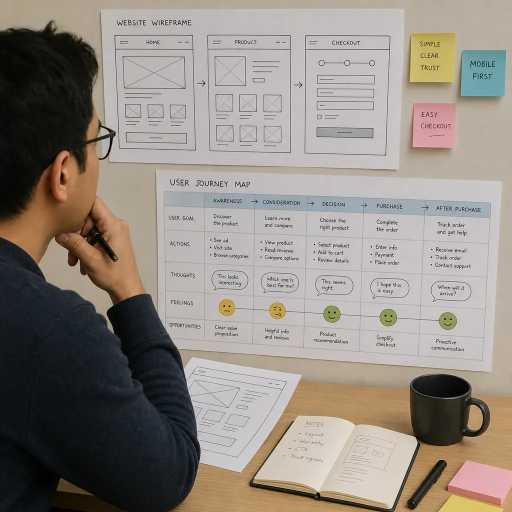
Effective web design is the balance of clear visuals, intuitive structure, reliable performance, and a brand experience people remember. A strong website does more than look polished; it helps visitors understand where they are, what they can do next, and why they should trust the business behind the page. Whether you are planning a new site, refreshing an outdated one, or speaking with a website development company, the principles below will help you make better design decisions from the start.
What makes web design effective?
Effective web design makes a website easy to use, easy to understand, and aligned with the goals of the business and its visitors. It combines layout, content, navigation, accessibility, speed, responsiveness, and visual style into one connected experience. A beautiful site that confuses people is not effective, and a functional site that feels outdated or off-brand can still weaken trust.
Good design starts with intent. Before choosing colors, animations, or a homepage layout, define what the website needs to accomplish. A service business may need inquiries, calls, and credibility. An ecommerce store may need product discovery, checkout confidence, and repeat purchases. A software platform may need clear onboarding, feature education, and conversion paths. The best web design decisions are the ones that support those outcomes without adding unnecessary friction.
User experience is the foundation
User experience, often called UX, is the practical side of how visitors move through a site. It asks simple but important questions: Can people find what they came for? Do pages load smoothly? Are calls to action clear? Does the design reduce hesitation instead of creating it?
A user-friendly website usually has predictable navigation, readable content, visible contact options, and a layout that guides attention naturally. It avoids burying important pages, crowding the screen, or forcing users to guess what a button does. When a visitor lands on a page, they should quickly understand the offer, the next step, and the value of taking that step.
Helpful UX choices include:
- Clear page hierarchy: Put the most important message near the top and support it with concise sections below.
- Obvious calls to action: Use buttons and links that describe the action, such as “Request a quote” or “View services.”
- Simple navigation: Keep menus organized around what users actually need, not internal company structure.
- Consistent patterns: Reuse layouts, button styles, form behavior, and labels so the site feels familiar as people browse.
- Reduced cognitive load: Break complex information into sections, bullets, visuals, and short paragraphs.
This is where a website design agency can add real value. Experienced designers think beyond appearance and map the journey from first impression to conversion, making sure the website supports both user needs and business goals.
Visual hierarchy guides attention
Visual hierarchy tells visitors what to notice first, second, and third. It is created through size, spacing, color, contrast, alignment, and placement. Without hierarchy, every element competes for attention, and the page feels noisy even if the content is useful.
Headlines should communicate the main idea quickly. Supporting text should explain the benefit or context without becoming dense. Buttons should stand out enough to be noticed, but not so aggressively that they overpower the page. Images should clarify the message, show the product or service, or create emotional connection rather than filling empty space.
Several classic design principles shape strong hierarchy:
- Balance keeps layouts stable and intentional, whether symmetrical or asymmetrical.
- Contrast separates important elements from the background and improves readability.
- Emphasis directs attention to priority actions, messages, or offers.
- White space gives content room to breathe and makes pages feel more premium and easier to scan.
- Unity ensures colors, typography, imagery, and components feel like part of the same brand system.
These principles are especially important for businesses comparing web sites design options. A template may look attractive at first glance, but effective design depends on how well the visual system supports the message, audience, and conversion path.
Performance and responsiveness shape trust
Visitors may not describe a website as “high-performing,” but they feel it when pages load quickly and work smoothly. Slow pages, shifting layouts, oversized images, and broken mobile experiences can make a business seem less reliable before a visitor reads a single sentence.
Responsive web design adapts a website to different screen sizes, including desktops, tablets, and phones. Mobile-first thinking goes one step further by designing for smaller screens early, then expanding the experience for larger devices. This matters because mobile users often browse quickly, compare options, and expect essential information to be immediately available.
Practical performance and responsive design priorities include:
- Compressing and properly sizing images before launch.
- Keeping layouts clean enough to work on small screens.
- Making tap targets large enough for mobile users.
- Avoiding unnecessary scripts, heavy animations, and cluttered plugins.
- Testing key pages on multiple devices and browsers.
- Keeping forms short, clear, and easy to complete.
A web page design company should not treat performance as an afterthought. Design and development decisions are connected: a visually rich page still needs to be built in a way that loads efficiently, responds cleanly, and supports search visibility.
Accessibility makes design better for everyone
Accessible design helps people with different abilities, devices, and browsing conditions use a website successfully. It is not a separate layer added at the end; it should influence color choices, typography, forms, buttons, menus, images, and code structure from the beginning.
Good accessibility practices include strong color contrast, meaningful alt text for images, keyboard-friendly navigation, descriptive link text, readable font sizes, and semantic page structure. These details help users with visual, motor, cognitive, or situational limitations. They also tend to improve overall usability, because clear structure benefits everyone.
For example, a visitor using a screen reader needs properly labeled forms and headings that make sense in order. A mobile user standing outdoors needs enough contrast to read the screen in bright light. A busy decision-maker scanning quickly needs descriptive section headings. Accessibility and usability often solve the same problem from different angles.
How is web design different from web development?
Web design focuses on the user-facing experience: layout, visual style, content presentation, interaction patterns, and the overall feel of the site. Web development turns that design into a working website through code, content management systems, integrations, hosting, databases, and technical functionality. The two disciplines are different, but the best results happen when they work together from the beginning.
A web design agency may lead brand expression, wireframes, UI design, and user flows. A website development company may focus on implementation, performance, security, integrations, and scalable architecture. In many projects, one team handles both, especially when the site needs custom features, ecommerce functionality, portals, dashboards, booking tools, or advanced forms.
This is where custom software development can overlap with web design. A standard brochure website might only need clear service pages and contact forms. A more complex business may need a client portal, internal workflow system, quote calculator, membership area, or product configurator. Those tools need more than attractive screens; they need thoughtful UX, reliable logic, and development choices that support long-term use.
Design styles should serve the brand
Trends can inspire a project, but style should never be chosen simply because it looks popular. The right visual direction depends on the brand personality, audience expectations, content needs, and business model. A law firm, fashion label, SaaS company, nonprofit, and creative studio should not all look the same.
Common web design styles include:
- Minimalism: Clean layouts, generous space, and purposeful content. Best for brands that want clarity, calm, and focus.
- Swiss-inspired design: Grid-based structure, strong typography, and order. Useful for professional, editorial, or information-heavy sites.
- Editorial layouts: Magazine-like pages with bold headlines, rich imagery, and storytelling flow. Strong for content-led brands.
- Flat design: Simple shapes, clear icons, and straightforward interfaces. Often effective for corporate, SaaS, and product sites.
- Bento layouts: Modular blocks that organize features, benefits, and media into digestible sections.
- Retro or nostalgic design: Familiar colors, textures, or references used carefully to create emotional connection.
- Brutalist design: Raw, bold, unconventional layouts. It can be memorable, but it must fit the audience and brand tolerance for disruption.
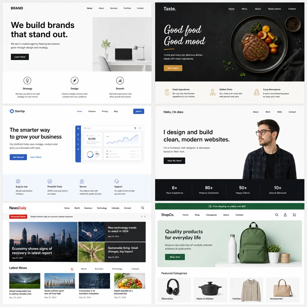
The goal is not to copy a style exactly. The goal is to create a visual system that feels distinct, supports the content, and remains usable as the website grows.
Navigation determines how confidently people move
Navigation is one of the most practical parts of web design. If users cannot find key pages, even strong content and visuals lose impact. Menus should reflect common user tasks: learning about services, viewing work, understanding pricing or process, reading resources, and contacting the business.
Different navigation patterns solve different problems. A classic top menu works well for many business sites. A sticky menu can help users move around long pages without scrolling back to the top. A hamburger menu saves space on mobile devices, while dropdown menus can organize larger service sets. Sidebar navigation may work well for documentation, resource libraries, or dashboards.
The best choice depends on content complexity. If the site has only a few core pages, keep the menu simple. If it has many services, locations, products, or resources, structure the navigation around user intent rather than listing everything at once. A professional website design agency will usually review the sitemap before designing pages, because navigation problems often begin with poor information architecture.
Content and design must work together
Design cannot fix unclear messaging. A visually strong website still needs concise copy, useful page structure, and language that answers real visitor questions. Content tells users what you offer, who it is for, why it matters, and what to do next.
Design supports that content by making it scannable and persuasive. Headlines introduce the main point. Subheadings break the journey into logical steps. Icons and images add context. Testimonials, case studies, certifications, or process explanations can build trust when they are available and relevant. Calls to action give the visitor a clear next move.
A simple content checklist for important pages:
- Does the hero section explain the offer clearly?
- Is the primary audience obvious?
- Are benefits connected to practical outcomes?
- Are services or features easy to compare?
- Is there a clear next step above and below the fold?
- Are trust signals included where appropriate?
- Is the copy specific enough to avoid sounding interchangeable?
When design and content are planned together, pages feel more natural. The layout is not just decoration around words; it becomes the structure that helps the message land.
Choosing the right professional partner
Hiring a website development company, web design agency, or web page design company is easier when you know what to evaluate. The right partner should be able to explain both creative and technical decisions in plain language. They should also ask about your audience, goals, content, brand, and operations before recommending a solution.
Use these criteria when comparing providers:
- Portfolio relevance: Look for work that reflects the complexity, tone, or functionality your project needs.
- UX process: Ask how they plan user journeys, navigation, wireframes, and conversion paths.
- Responsive expertise: Confirm that mobile and tablet experiences are designed and tested, not simply resized.
- Technical capability: Make sure they can support the platform, integrations, CMS, or custom software development your project requires.
- SEO awareness: Design choices should support crawlable structure, readable content, performance, and metadata basics.
- Accessibility practices: Ask how accessibility is considered during design, development, and testing.
- Post-launch support: Clarify maintenance, updates, training, analytics, and future improvements.
The cheapest option is not always the most cost-effective, and the most visually impressive option is not always the most strategic. Look for a team that can connect business goals with user needs and then build a website that is maintainable after launch.
Strong web design is intentional, not accidental
Effective web design comes from thoughtful choices repeated across the entire experience. Every layout, menu, button, image, form, and content block should help users move with confidence. A site does not need to be flashy to succeed, but it does need to be clear, responsive, accessible, visually aligned with the brand, and built for real people.
If you are planning a new project, start with the fundamentals: define your audience, clarify your goals, organize your content, and choose a design direction that supports trust and action. Then work with a capable design and development partner who understands both how the site should look and how it should function. That combination is what turns web design from surface-level styling into a business asset.